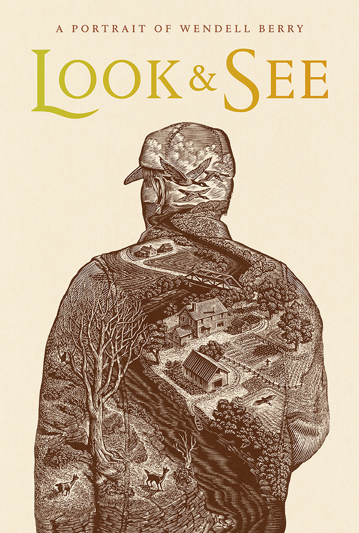
Renaming the film "Look & See" among other things has necessitated a new poster design. This is especially important as many Kickstarter backers opted to receive letter-pressed versions of the official film poster. Future versions may evolve to incorporate credits, awards and the like. But for backers, we required a version completely free of marketing metadata. This is that image.
(Wood Engraving by Wesley Bates, Typography by Mark Melnick)
In the treatment above, we are using a subtle autumnal gradient from the L to the E. However, the gradient may not appear in the letter-pressed editions depending on production options. The largest posters especially involve hand-rolling the ink across the raised forms and that may require a different treatment. (We especially loved Mark's letter shape of the "L". It evokes a scythe which of course is used to hand mow grasses.)


